

Description: Your banners don’t sell or you have not even the slightest idea of how it must look? Our guide covers all questions related to making banner creatives: from finding images to writing a call-to-action that will convert.
A guide to banner advertising: how to build a creative that will earn
In 2021, we proudly announced online banners on Clickadu. Although they seem one of the most straightforward ways to attract users to a website, they don’t always work as nicely as you expected. In this guide, we gathered all the most effective tips that will help you boost your traffic from online banners and fall in love with this ad solution.
A guide to banner advertising: how to build a creative that will earn
Online banners originate from the good old street billboards that still fill the city streets. And like on the streets, an online banner must capture people’s attention and motivate them to lead your ad campaign goals.
However, online banners have some serious advantages over outdoor advertising. Here are the main online banner ads features:
In this guide, we will discuss the latter one: how to create a banner that will show high conversion rates and shine out, overcoming banner blindness? Don’t be confused, we’ll explain what’s banner blindness and teach you more useful terms very soon.
Suppose you successfully launched your banner campaign and expect colossal traffic. However, nothing happens, and a couple of site visits seem to be misclicks. What are possible reasons for that? One of them is the wrong choice of creatives.
First, what is a creative? In the advertisement industry, it is simply an ad that a user sees on a webpage. In our case, a creative is your banner.
Online banner creatives can deliver your message in various formats: static images, GIFs, or videos. A banner must have two components: a visual element and a text, both arousing a user’s interest and motivating them to follow the link.


Banner scheme
Come into the user’s world: they see tons of banners daily unless they use AdBlock. In the end, they start ignoring all ads (often unconsciously): this is what we call banner blindness. To inspire a user to click on your banner, you must make sure it has two features:
Suppose you need to create a banner for your campaign and find an appropriate image. What should you consider first? Sometimes a product photo is enough. But what if your banner is about some service or promotion and the image can’t be as straightforward as a picture of a car or a game screenshot?
In this block, we gathered all working tips and ideas on banner visual creatives: read on, to know how to find, choose, and edit visual formats.
Before you start browsing for various pics, think of the product you need to promote. The thing is that you can’t just go with a random image and some motto: even if it looks perfect, it may just not work with a particular vertical. Thus, you need some research: what will you advertise, and what will trigger users to become instantly engaged?
Every industry has its nuances, so there’s a different approach for various products. It does matter: for instance, the concepts working for Nutra might fail with, say, gambling.
Here are tips for the most popular verticals and creatives that work best for them.

BAD CREATIVE

GOOD CREATIVE
When you want to inspire people to risk their money, the best way is to persuade them it will payout. A good solution for casino sites is to demonstrate that someone’s just snatched a large sum. It will cause a slight frustration of a missed profit and motivate a user to follow the link hoping they might be the next lucky one.
Another option is to make users think they can already claim some amount of money and will simply toss it out of the window if they ignore your ad. It may look like: ‘Your welcome bonus of $1,000 is waiting for you’ or more straightforward ‘You won $1,000, come and grab your winnings’.

BAD CREATIVE
GOOD CREATIVE
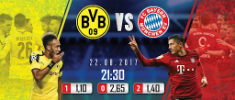
While creatives for gambling sites also work fine for sports betting, more opportunities are on hand. Pretty obviously, sports bettors love sports, so you can engage them by displaying some popular matches or teams on your banner.

BAD CREATIVE

GOOD CREATIVE
The images of posh girls from glossy magazines work, but they are everywhere on the Internet. To inspire trust in a particular dating site, you must make users think they are looking at a real woman they are likely to meet if they click on your ad. Overall, the picture on your dating site creative should represent a girl-next-door image, not someone ungettable.

BAD CREATIVE

GOOD CREATIVE
Banners are great for video games ads: they allow you to show the best graphics and gameplay features. A user should understand the game from a single glance at your banner: is there a fantasy adventure or intense tank battles awaiting them?
Thus, your creative for a gaming banner must contain an image, gif, or video from the game itself and a call-to-action button like Play Now.

BAD CREATIVE

GOOD CREATIVE
Banners for the ecommerce vertical should focus on a particular product: users must immediately see what they can buy in the store. The conversion rate will significantly increase if you offer some large discounts. The most working banner formula here is ‘an image of a product + a discount offer.

BAD CREATIVE

GOOD CREATIVE
Here you can opt for two opposite approaches. The first one implies showing some scary but intriguing images with a threatening text: for instance, a person suffering from acne. Don’t go too far, though: it must be somewhat creepy, but not extremely terrifying so that a moderator could approve it. Another option is to show people who don’t suffer from medical issues anymore and inspire users to follow their examples.
Don’t blindly stick to patterns we give: numerous ideas can fit your needs. Here is what can boost your imagination and help if you are still struggling to find the right approach to your banner creative:
We don’t mean stealing ideas or copying creatives, but monitoring the performance of your colleagues won’t hurt. Pay attention to the other banners from your vertical, analyze them, and get your inspiration from them.
Your personal manager at Clickadu always has a finger on the pulse and is willing to give you some extra tips. If you doubt that your creative is good enough, don’t hesitate to ask us: we know what is trendy and what you should avoid.
Bright colors always attract attention. Besides, different colors provoke different feelings: for instance, red is usually associated with some danger or call to action, while blue is more calming. Think over the colors prevalent in your creative and how they can impact the conversion.
Clickadu offers two banner sizes to choose from 300×250 and 300×100. They are available for both video and image types. Your file formats have to be .jpg .jpeg .png .gif or .mp4 if it’s a video; file sizes are up to 512 KB and 1 MB. You can always crop your pictures and change them anytime at our Self-Serve Platform.
Your banner leads a user to some link at the site you advertise. It must not be just a random link or simply a main page. If your creative shows a particular offer, allow a user to get this offer within a single click: few people will browse the site to find what they saw in the ad. Suppose your banner lures users to play poker on some casino site. Make sure the link does lead them to a poker room, not roulette or bingo rooms!
Now that you have an idea of concepts, it’s time to create your banner! But where do you take all these images with people, money, slots, and other photos that sell? It would be all easier if you had a team of professional designers at your disposal, of course, but never mind: creating a banner by yourself is not a big issue.
Suppose you found relevant images, but a single image is not enough: you need to add some copy or a call-to-action. In other words, you need to edit your image or videos: insert some text to make it sell. We’ll speak about texts later in this guide and focus on the tech side for now. So, what can you use?
Don’t worry: you won’t require any complicated professional tools. In fact, you already have some software on your PC. Besides, you can install some free editors: they are intuitive enough even for beginners.

Whatever great it might be, an image will not work alone, so your banner must contain some catchy and inspiring copy. Texts have great power in marketing, even when they consist of just a couple of words, so you must consider two things here: what to write and how your text will look on your banner.
A Call-To-Action or CTA is a special phrase that motivates readers to do some action immediately: click, buy, register, send a request, etc. It is a very short, but strong form of triggering users, so consider it as a must-have for your banner. How do you create a working Call-To-Action phrase?
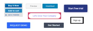
Sometimes, you don’t need to reinvent the wheel and can stick to very straightforward classic CTAs:
Your CTA must be clear and confident. You don’t offer a user to visit a site sometime in the future: you need to catch their attention and persuade them to do the desired action within a couple of seconds.
The CTA can be more creative and personalized. For instance, you can use ‘I’ instead of ‘You’ or combine the CTA with some short copy like ‘50% discounts, only today’. The latter example will boost a user’s motivation by creating a fear of missing out.
However, the main CTA features remain the same, no matter what exactly you write. It is always a short phrase containing an action verb that catches attention and engages a user. Don’t try to insert too much information in your banner: your text must contain the main message of your ad to get an immediate response.
Even the best CTA will go to waste if it’s not readable. Fonts, colors, and location matter and must fit your image or video. What can you do to make your text work and not spoil the whole impression?
Suppose you prepared some top-notch creative, and it is likely to convert. It’s half the battle, but what’s next? Now you are entering another stage of your campaign: the first launch and first results. However, you still can’t be 100% sure it will work out the way you need. How to get the most out of this step and sure up you are on the right track?
Multivariate testing: why is it essential to make more than a single creative?
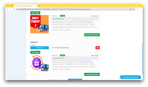
Clickadu allows you to add up to five creatives within a single campaign and track statistics for each of them. We highly recommend taking advantage of this opportunity: it will let you know which banner works better for your campaign goals.
This is what marketers call multivariate testing: you show several versions of your creative to users and compare stats for each. In the end, you will find the most money-making one worth investing in a larger budget.
Sometimes, you might discover that the creative you considered high-end does not sell: it is perfectly normal and is the reason why you need this testing. Take your time to think of at least two banner variants: trust us, it may save you much time and money in the future.
In fact, creative testing is a large topic worth a separate discussion. We will tell you more about how it works and what you can achieve with creative testing in one of our further articles, so remember the basics for now.
Before you unlock your creative potential, you need to know some essentials about the tech side of the process. We at the Clickadu team made our best to simplify it, so here is a brief guide on how to launch your banner advertising campaign:
You can find very detailed instructions with screenshots here: How to create a Banner campaign – Clickadu Support Center.
We hope our tips will help you get more clicks, boost traffic, and make money. Or maybe we inspired you to start your first banner campaign? Remember that whenever you feel you missed something or need advice, you can always turn to our support. Clickadu team will be happy to guide you through!
